Ass Hat
Home
News
Events
Bands
Labels
Venues
Pics
MP3s
Radio Show
Reviews
Releases
Buy$tuff
Forum
  Classifieds
  News
  Localband
  Shows
  Show Pics
  Polls
  
  OT Threads
  Other News
  Movies
  VideoGames
  Videos
  TV
  Sports
  Gear
  /r/
  Food
  
  New Thread
  New Poll
Miscellaneous
Links
E-mail
Search
End Ass Hat
login

New site? Maybe some day.
Posting Anonymously login: [Forgotten Password]
returntothepit >> discuss >> Drawing a new logo. Need opinions please... by Joshtruction on Jun 8,2008 2:49pm
Add To All Your Pages!
toggletoggle post by Joshtruction   at Jun 8,2008 2:49pm


How does that look for a rough idea?
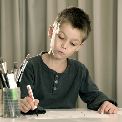


toggletoggle post by xmikex at Jun 8,2008 3:02pm
Josh hard at work:


toggletoggle post by Joshtruction   at Jun 8,2008 3:14pm
xmikex said[orig][quote]
Josh hard at work:


I wonder if he escaped from Mr Macs Workshop...


toggletoggle post by SacreligionNLI at Jun 8,2008 3:18pm
no one escapes from mr macs workshop


toggletoggle post by Joshtruction   at Jun 8,2008 5:27pm
SacreligionNLI said[orig][quote]
no one escapes from mr macs workshop


then how did we get that PSA?


toggletoggle post by Joshtruction   at Jun 8,2008 8:27pm
no constructive critisism? MFR?


toggletoggle post by Wantonnabe at Jun 9,2008 2:33pm
OK.
The circles not circular, the T's not symmetrical and the banner is way too linear (but maybe thats what your going for with that).

With the negative space on the letters in the circle make sure its open enough to not lose the detail when you shrink it AND that the the empty space within and solid lines without have the same thickness.

Suggestions: Find a book or websight of fonts, get a compass and look up some tattoo designs with banners.

Clean it up, solidify the colors and shrink it. Then see how it appeals to you.

Get tracing paper, fold it in half draw one side and trace the other to accomplish any symmetry. Re-trace and re-draw anything you want to change as you go. And map out guidelines for the top and bottom of letters within the banner to make them the same size. Spacing them proper is critical too.

Class dismissed


toggletoggle post by sxealex   at Jun 9,2008 2:36pm
steal your art


toggletoggle post by xmikex at Jun 9,2008 2:39pm
SacreligionNLI said[orig][quote]
no one escapes from mr macs workshop


HAHAHA


toggletoggle post by DYA / NLI at Jun 9,2008 4:27pm
xmikex said[orig][quote]
SacreligionNLI said[orig][quote]
no one escapes from mr macs workshop


HAHAHA


Song title'd.


toggletoggle post by Joshtruction   at Jun 10,2008 3:05am
Wantonnabe said[orig][quote]
OK.
The circles not circular, the T's not symmetrical and the banner is way too linear (but maybe thats what your going for with that).

With the negative space on the letters in the circle make sure its open enough to not lose the detail when you shrink it AND that the the empty space within and solid lines without have the same thickness.

Suggestions: Find a book or websight of fonts, get a compass and look up some tattoo designs with banners.

Clean it up, solidify the colors and shrink it. Then see how it appeals to you.

Get tracing paper, fold it in half draw one side and trace the other to accomplish any symmetry. Re-trace and re-draw anything you want to change as you go. And map out guidelines for the top and bottom of letters within the banner to make them the same size. Spacing them proper is critical too.

Class dismissed


Circle is circular... pencil was under the paper when I took the pic so it throws it off. None of that is anywhere near final draft... roughed that up free hand in like 2 minutes. Just trying to get a decent theme and then do it for real. As for the banner... I kind of just slapped it there last second to see how it would look. I also just wrote across it without a care in the world. Linear was the idea though. Good idea with the tracing paper. Thanks for the input and idea's man!


toggletoggle post by plaguecalledman at Jun 10,2008 9:12pm
I think you should put the R backwards just to be extra cool


toggletoggle post by the_reverend   at Jun 10,2008 9:15pm
needs moar boners


toggletoggle post by Joshtruction   at Jun 11,2008 3:24pm
plaguecalledman said[orig][quote]
I think you should put the R backwards just to be extra cool


stop dropping my IQ.


Enter a Quick Response (advanced response>>)
Username: (enter in a fake name if you want, login, or new user)SPAM Filter: re-type this (values are 0,1,2,3,4,5,6,7,8,9,A,B,C,D,E, or F)
Message:  b i u  add: url  image  video(?)show icons
remember:watch out for plagues of locusts
[default homepage] [print][1:58:53pm Apr 23,2024
load time 0.01149 secs/12 queries]
[search][refresh page]