|
New site? Maybe some day. 

|
|
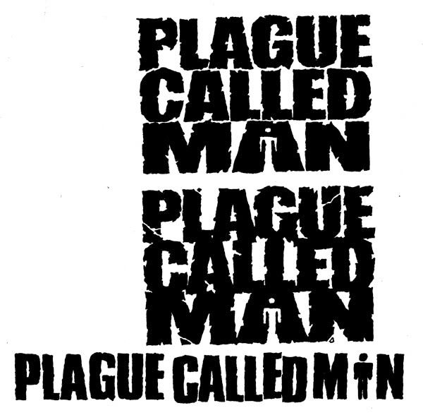
Definitely not the third one because it looks like Plague Called Min. I like the #5 and #6 the best. |
|
|
ZJD said: | Definitely not the third one because it looks like Plague Called Min. I like the #5 and #6 the best. |
So far everyone likes 6 including my self. I dig number 2 also. |
|
|
Second logo in the first image. |
|
|
if youre not power violence or extremely crusty thrash i hate you for using any of those last three.
damn you MFR |
|
|
da chief said: if youre not power violence or extremely crusty thrash i hate you for using any of those last three.
damn you MFR |
we are like thrash/deathmetal/blackmetal |
|
|
Aura_At_Dusk said:
What I was picturing in my head was pretty close to that, and I think so far it has my vote. I wonder whatb the rest of the band thinks haha. |
|
|
joshtruction said: da chief said:if youre not power violence or extremely crusty thrash i hate you for using any of those last three.
damn you MFR |
we are like thrash/deathmetal/blackmetal |
t  |
|
|
i like #2 and #6. and as far as crusty thrash, does having crotch rot and decaying feet from athletes foot count? because i have that. |
|
|
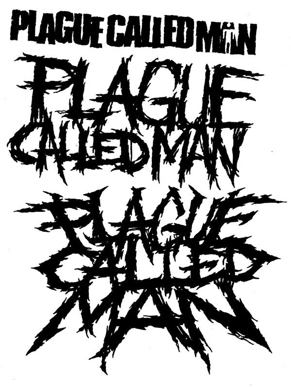
you guys should decide on 2, one of the not so metal ones and one of the uber brutal ones. my picks are #2 and #5. the last 2 look too much like a typical MFR logo. |
|
|
the second logo is the best one. it stands out more than the rest and is more cohesive than the first logo. logos 5-7 are way too typical. which one is mark pushing for? as a graphic designer with a masters degree, i have to say the second logo is the best by far. |
|
|
2nd one is my favorite as well. Most of you have good eyes, haha. And yeah, a few of them are terrible by my standards, but I bite the bullet and show bands everything I make for them...which has been a mistake in the past, and I dig my own grave on that one, but I trust Josh's judgment.
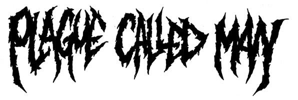
I'm glad no one said the last one, because I despise that logo with a passion, haha. Number 6 is the only one of the "crusty" logos if you will that I would consider, but it needs much amping up so it doesn't look too typical. |
|
|
2 and 6
5 looks like those like 5 or 6 deathcore bands that all have the exact same logo |
|
|
2 and 6 mainly six because it looks like craigs hairy back, well not hairy anymore since he Naired it u fuckin fag |
|
|
I'd say the first one on the 2nd image. But maybe not for a thrash/death metal band. |
|
|
I like 6 the most.. but I also like the last one. Fuck off |
|
|
Maybe incorporate the bathroom guy in the 6th one, i bet that would seel everyone |
|
|
atthehaunted said: | Maybe incorporate the bathroom guy in the 6th one, i bet that would seel everyone |
In theory that would work, but visually it would look horrendous (at least to me...dreadkill, back me up on this, haha!) to mix the "messy" logo qualities with the cleaner lines of the bathroom guy. And making the bathroom guy messy will just look half-assed and not recognizable.
I say you guys just change your name to Plague Called Bathroom Guy and all problems will be solved. |
 
| [default homepage]
|
[print][ | 5:01:46pm Apr 25,2024
load time 0.01252 secs/12 queries] | [search] | [refresh page] |
|