


|
New site? Maybe some day. 
|
|
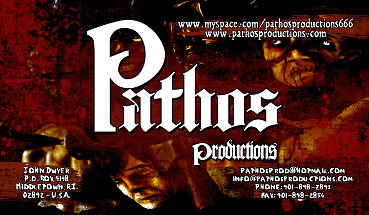
Something like this, I want to change the bottom fonts for sure.
|

|
|
Yeah, the bottom fonts should definitely be more legible. |
|
|
there's alot of 'whitespace' over to the left of the Pathos logo, perhaps layering another one of thoe zombie faces in the background will balance out the area.
the art and fonts I think are great, but the layout is unbalanced. |
|
|
i agree with changing the bottom fonts and balancing out the layout. there needs to be a hierarchy established in the information. aside from the name of the company, what is the most important info? right now, it looks like the myspace page and website info is more important than the company's address and other contact info. |
|
|
It needed a couple things:
1. fat chicks in party hats. |
|
|
do'nt have the myspace above the .com. I dunno for some reason it seems gay to me. |
|
|
AUTOPSY_666 said:
Something like this, I want to change the bottom fonts for sure.
|
I like it, the text is very clear on the background which is very important and the overall design is good too. If you do change the fonts make sure they're legible and bold enough so the background doesn't overpower because the information is key. But how it looks right now I highly recommend it. |
|
|
What size is this going to be printed?
If it's a wallet sized card, that's probably going to be way to much detail to print with clear quality. |
|
|
i've seen more detailed art be clear on wallet sized. |
|
|
It will be 350 dpi.
I already planned to put the myspace under the webpage.
|
|
|
looks pretty sick...don't know what else to suggest other than what's already been mentioned
the edited one looks pretty good...but i'd move the pathos logo to the left, like a 1/4" from the edge, and stretch it out a little so it reaches a little past the center, and definitely change the font for the text, making it bigger might make the info more legible as well, though |
|
|
John, where are you getting them printed? I work at a full color print shop and you should let me get you a price. |
|
|
I dont like the eyes on the top right, looks weird. |
|
|
niccolais suggestion is definetly the way to go. |
|
|
gimme a few, ill have one, perfect for ya... |
|
|
nate nli said: | John, where are you getting them printed? I work at a full color print shop and you should let me get you a price. |
Ben Kolts from MALAMOR said he can do 5000 double sided (obviously I'm gonna to put something different on back) for $100 plus like $10 shipping, pretty hard deal to beat.
 |
|
|
yeah 5000 DS is hard to beat at that price... I tried... |
|
|
I will do the next LEUKORRHEA CD too, haha.
|
|
|
sometime soon I'll have to mail ya... see what can possibly happen, or not.... |
|
|
You should get original artwork, Instead of the artwork from the Embalmer CD  |
|
|
I thought it'd be cool to mix a bunch of art from my CDs, a collage, we are working on it now.
|
|
|
Here's the latest version...
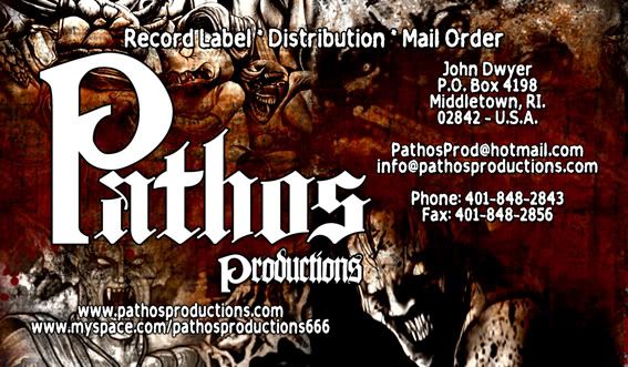
I think this is the one. |
|
|
again, I think it might be hard to print that background high quality without a large loss of detail.
I think the logo should be centered with the other information around it somehow, but it's your decision.
Also, I see there's still no fatchicksinpartyhats.com link...
Maybe Mark Richards will be able to chime in, he recently had buisiness cards printed high color gloss and would be able to give youadvice based on designing his and how much detail is too much detail. |
|
|
That's the one.
|
|
|
very nice, lets see paul alan's card.
look at that subtle off white coloring, the tasteful thickness of it... oh my god.. it even has a watermark. |
|
|
Looks good. I look forward to seeing them in my future CD purchases. |
|
|
I dunno about the rest of you, but the first thing that came to my mind when I read the title of this thread was.....

and if you can't recognize that, you don't belong here. |
|
|
I feel that Soho has gotten too commercial. |
|
|
AUTOPSY_666 said:
That's the one.
|
i like this one waaay better than the first one, but if it was my business card, i would leave out the art on the bottom, or at least fuck with levels/opacity/hue, etc. the way the godless rising and embalmer art are positioned, they look pasted on rather than fully integrated with the whole composition. the embalmer art doesn't contrast well with the rest of the card either. since all the other background artwork is sort of subdued and not too high contrast, the high contrast of the embalmer art sticks out like a sore thumb. i'm not sure if i'm 100% satisifed with the arrangement of text either. it looks a little too jumbled, since all the key info looks to be together on the right, but then there's more at the bottom. i would probably re-arrange the text so it's all grouped together in the same place to unify everything (except the top line, which is fine where it is...maybe a liiitttle bit too close to the P in Pathos).
just my 2 cents. |
|
|
actually, i take back that the godless rising art looks pasted; it's just the contrast between that and the embalmer art that makes it all funky. the embalmer art still doesn't fit, in my opinion. |
|
|
xmikex said: I dunno about the rest of you, but the first thing that came to my mind when I read the title of this thread was.....
and if you can't recognize that, you don't belong here. |
yesssss |
 
| [default homepage]
|
[print][ | 8:59:24am Apr 24,2024
load time 0.01830 secs/15 queries] | [search] | [refresh page] |
|
